MokoBot - A smart vending experience
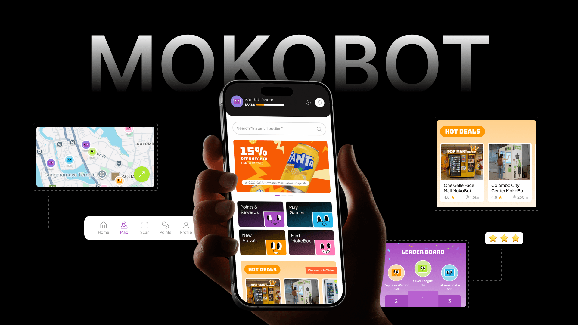
Mokobot is a smart vending mobile app designed to make every snack run faster, smarter, and more rewarding. I led the end-to-end product design from brand identity and UX research through to a full high-fidelity UI, reimagining the vending experience for a cashless, connected generation.
Research & Discovery
Starting with the right questions
Before designing a single screen, I needed to understand how people actually interact with vending machines today — and what it would take to make them reach for an app instead.
Research goals
How do people currently interact with vending machines — and where do they drop off?
What makes a cashless payment feel trustworthy enough to use at a machine?
What would genuinely motivate someone to open an app just to buy from a vending machine?
Methods used
Observation and Design Implications
"Users distrust QR payments they can't verify in real time."
Every payment state — pending, confirmed, failed — needs a clear, instant visual response on screen.
"Loyalty only works if the reward feels immediate, not something to collect later."
Points credited and animated on the same screen as purchase confirmation — not buried in a wallet tab.
"People abandon machines after walking to them and finding items out of stock."
Stock visibility before navigation is non-negotiable — the map must show availability, not just location.
"Existing vending apps feel like utility tools — nobody opens them unless they have to."
Mini-games and rewards give users a reason to open the app independently of a purchase.
Define
Who are we designing for?
Two distinct users drive the product. A convenience-first daily buyer and an engagement-driven loyalist. Both need the experience to feel instant and rewarding.

Sahan, 24
University student, Colombo. Grabs drinks and snacks between lectures.
Pay quickly without cash, find the nearest machine stocking what he wants.
Walks to a machine only to find it empty or cash-only.
Already uses FriMi and LankaQR daily. Expects cashless everywhere.

Nishadi, 29
AMarketing executive, Colombo. Buys from office vending machines daily.
Get something back for repeat purchases - discounts, perks, or rewards that feel worth earning.
Buys from the same machine every day with zero recognition or loyalty benefit.
Loyal to apps that reward her and already engages with loyalty programmes.
Branding & Visual Identity
Giving MokoBot a distinct visual voice
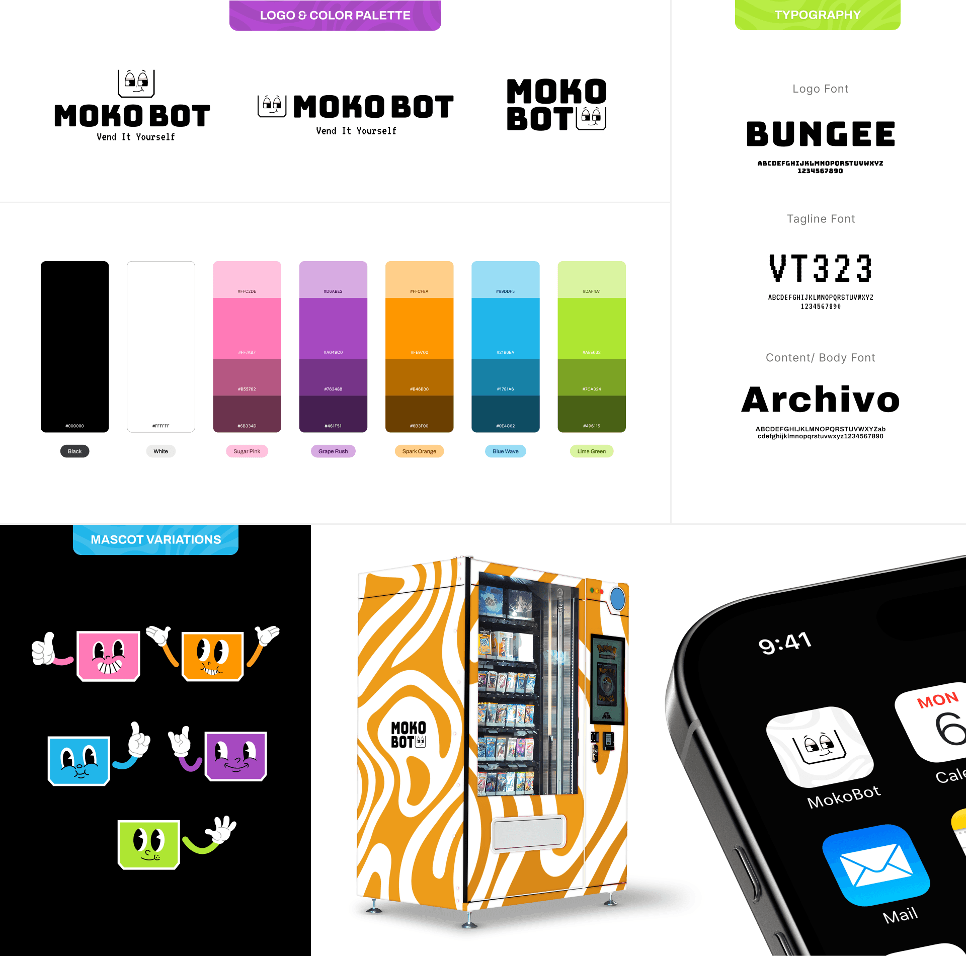
The brand identity was built around a bold, energetic personality that feels playful at the machine and trustworthy in the app — translated across logo, color, and type into a consistent system.
Key User Flows
How users move through the app
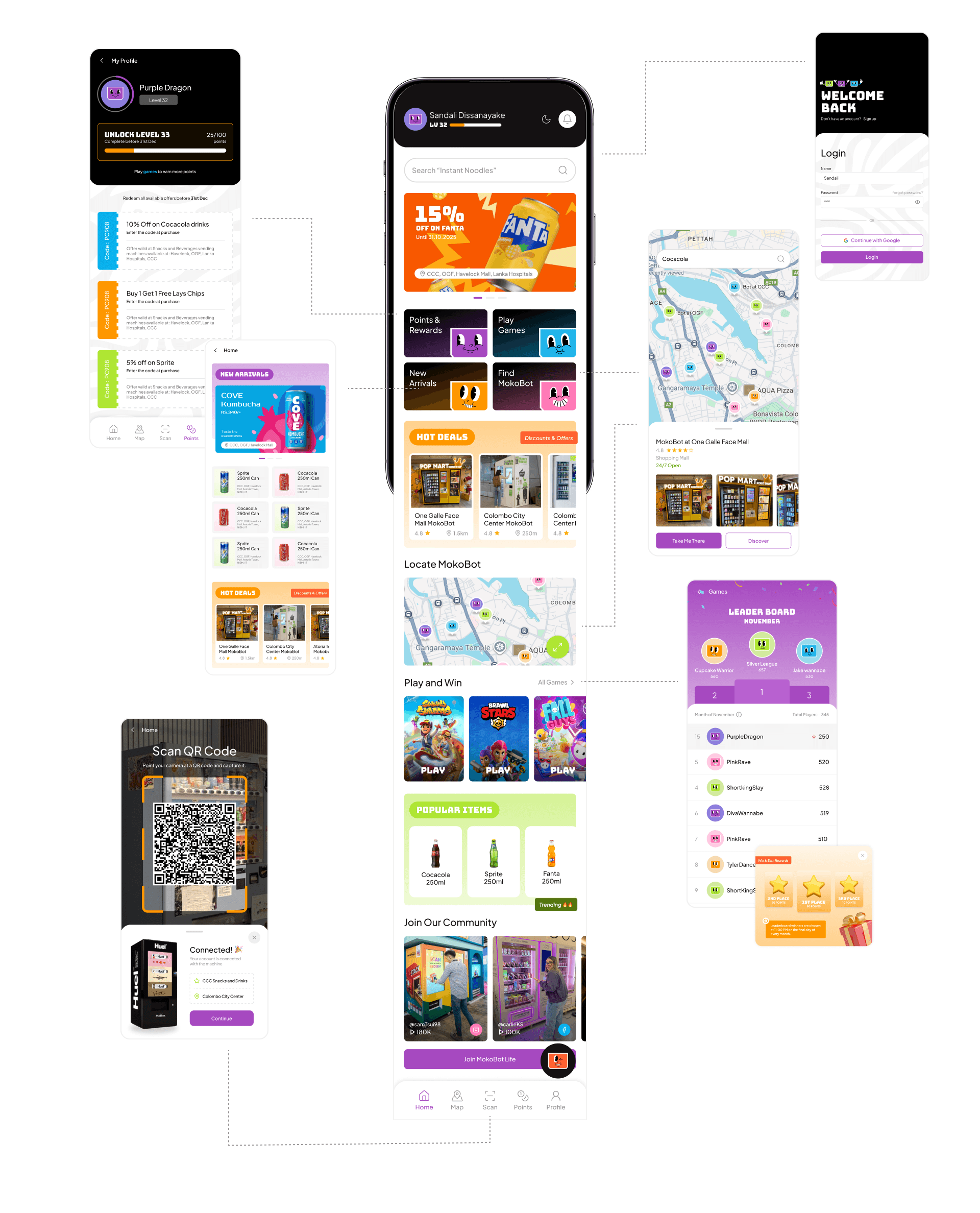
Three core journeys shaped the interaction design — each one mapped step by step to keep the path from intent to reward as short as possible.
Flow 01 — First-time purchase with QR
Register
Create account in seconds
Scan QR
Link app to the machine
Browse & pay
Pick item, apply promo & pay
Points credited
Reward lands instantly
Flow 02 — Rewards & mini-games
Home screen
Points, offers & games in one view
Play a game
Quick games under 60 seconds
Earn points
Complete level, unlock promo code
Redeem
Apply code at checkout
Flow 03 — Finding a machine
Search product
Type what you want
Map with stock
Machines with your item highlighted
Navigate
Google Maps directions
Indoor nav
VR walkthrough inside malls
UI Showcase
From screen to screen
Every screen designed with one question in mind, does this feel instant, rewarding, and effortless? Here's how that translated across